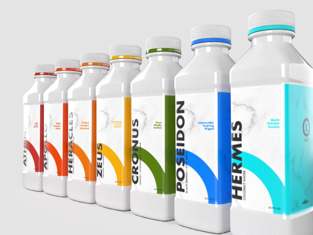
A healthy and high energy juice brand that is designed to motivate its consumers through the embodiment of Greek Gods and Goddesses.


Through an analysis of what aesthetically connects to the dominion of the God in question, certain colors have been picked to represent certain Gods.
The warmth and coolness of this color, aligns with the overall feeling of the God in question. A warmer color has blue undertones which aligns more with strength and nobility, while cooler colors have yellow undertones which evoke feelings of peace and happiness.

PACKAGING
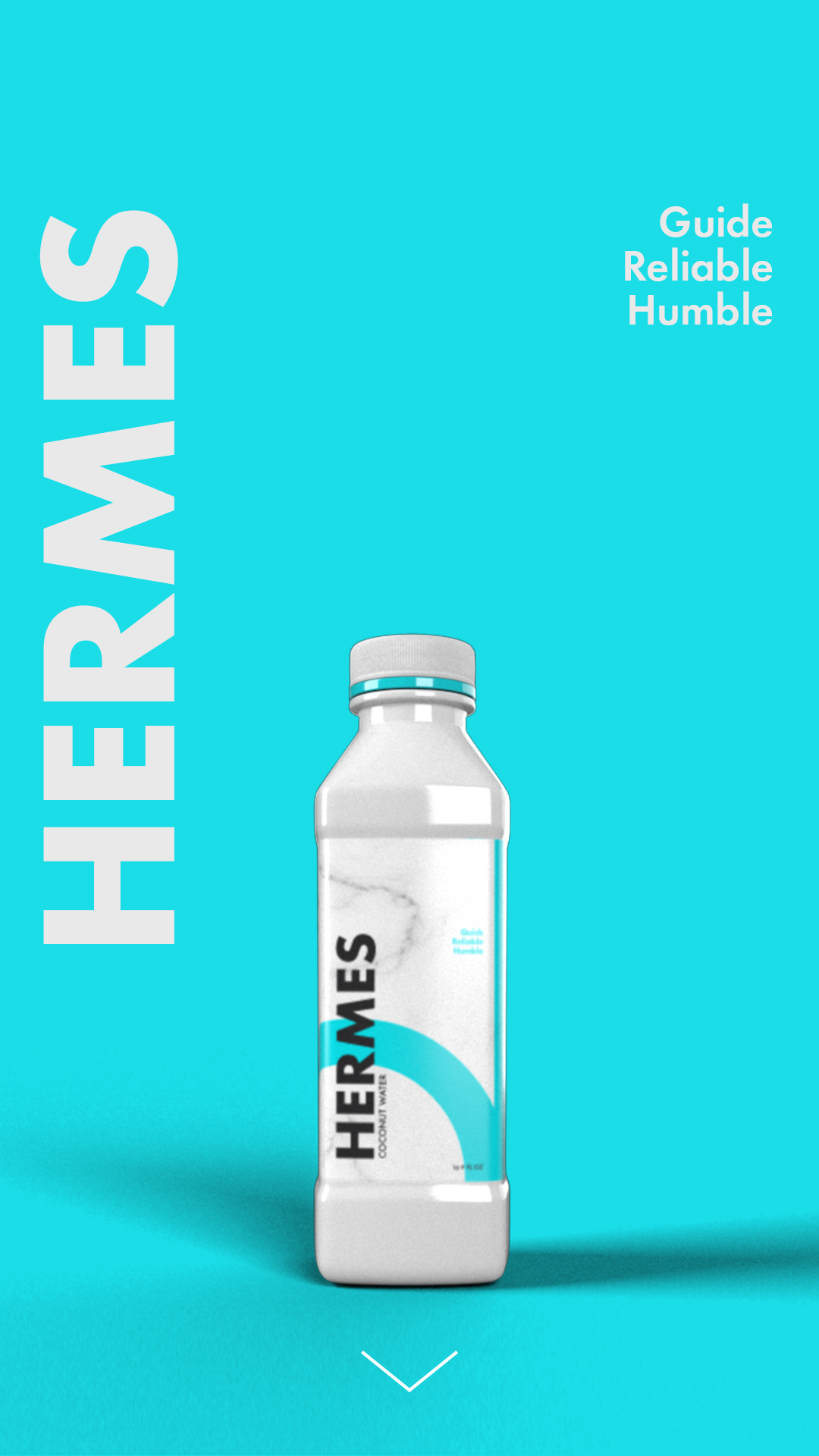
1st Bottle Design: The design of the bottles is simple, yet sleek. The plastic ring under the cap is the nimbus (or halo) for the God, symbolic of their divinity. The logo on the top of the bottle is meant to symbolize a gateway between the consumer and good health.
Bottles are made from 100% recyclable material and are perfect for reuse if consumers would like to refill with their own homemade juices or other beverages. The recyclable material is also 100% environmentally friendly. Structure for bottle inspired by JUST Water Company.
Materials: 54% paper , 28% plant based plastic, 3% aluminum, 15% protective plastic film
The messaging on the bottle are the attributes that should speak to the consumer and the qualities that they will want to embody as a consumer of this drink.


A bottle made of stainless steel, double wall plastic with insulation. The material keeps the juice fresh as well as the nutrients within the drinks. A sleeker, trendy look for the frequent consumer to use daily.